Anyways, I am working on a couple new levels, one is a foggy/snowy forest, and the other is a rooftop hop level where you're under constant fire from archers beneath you. They're currently not much to look at, but they'll be finished sooner or later.
I also made some very cool graphical upgrades.
I dramatically upgraded my UI/HUD.
Here is a quick evolution:
Original HUD
Second HUD

New HUD

So as you can see, my first HUD was fugly, the second was boring, and the new one I made looks fantastic. Everything fits perfectly into a snug area on the upper left side of the screen.
Also, you may not have noticed that the aspect ratio of the trees in the images seems a bit different in the three pictures. That is because I stretched out the display width of the game, so now the game is in "wide screen" meaning you can see more of the level at any given time. Blogger squished all three of the pictures into the same size, but if you view them at full size, you'll see the difference.
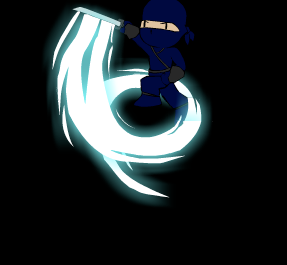
FINALLY, the other cool graphic change I made, is that I made the super slashes a lot more super, by adding a cool glow effect to them rather than just making them blue slashes.
Here is a sample:


Glowing super slashes are awesome. They're kind of Okami-like, but they GLOW, which makes them totally sweet.
ReplyDelete